You think you can build a button?
Context
A button is one of the most complex pieces of a particular design system. When checking out a new library, the button is the first component I look after. It can immediately tell me the quality, depth, and customization of the whole ecosystem.
If all of your buttons look like this:
<button>Click me</button>then we have a lot of work to do.
Thinking big
This guide is aimed at large-scale design systems but can be adapted for your side-projects or demos. I will try to cover all of the important aspects of a good button.
Starting off
You should use the native <button> element. You can find all its attributes here.
Size
All buttons should have two or three different sizes - do this with scalable sizes.
Usage:
Don't use a <div> or something else as a button. Stick to the button tag
<button size='small'>...</button>Hover state
This indicates that a button is clickable and interactive when hovered with the mouse. It's good practice that on mobile it should not have any hover state. Use media queries like this to make sure you can use the hover state:
@media (hover: hover) and (pointer: fine) {
  button:hover {
    color: red;
  }
}
Focus state
This important feature indicates that the focus is on the button. Add your own outline or leave the default one - but never remove it completely: outline: 0!
Shape
Maybe you want just an icon or an avatar button. Either way, this is made possible with a shape prop. What this does is set the border radius of the button. Again three or four variants would be good, i.e small, medium, large, full.
<button shape='medium'>...</button>Icons
Indicating external links, or action type - icons assure a better understanding of the button.
You should have two props suffix and prefix showing the position of the icon.
They could be passed as svgs or better as JSX.Elements.
Padding should be dynamically scaled depending on the variant of the button, and the size of the text.
<button prefix={<LeftArrow />} suffix={<RightArrow />}>
  ...
</button>
Variant
Implement as many variants as you want, but make sure to create as little styling as you can - to abstract the component when put together with other props. Some examples:
Disabled
Indicate that the button is disabled.
You can also use a tooltip, or a cursor: not-allowed;
Loading
Show that the action is asynchronous and is waiting for a response. A spinner is the most common way of indicating this.
Succes Criterion
According to w3.org: buttons should have at least 44 by 44px so make sure you achieve that to assure accessibility on mobile.
Read more here:
Full-fledged button example
~Implement your styles...
Interface with props:
interface Props {
variant?: ButtonTypes
loading?: boolean
shadow?: boolean
autoFocus?: boolean
disabled?: boolean
htmlType: React.ButtonHTMLAttributes<any>['type']
suffix?: React.ReactNode
prefix?: React.ReactNode
onClick?: React.MouseEventHandler<HTMLButtonElement>
className?: string
href?: string
}
const defaultProps {
variant: 'contained' as ButtonTypes,
loading: false.
shadow: false,
autoFocus: false,
disabled: false,
htmlType: 'button' as React.ButtonHTMLAttributes<any>['type'],
className: ''
}
type NativeProps = Omit<React.ButtonHTMLAttributes<any>, keyof Props>
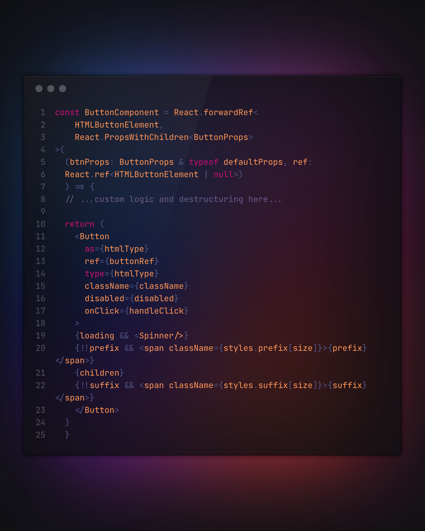
export type ButtonProps = Props & NativePropsButton Component:
const ButtonComponent = React.forwardRef<
	  HTMLButtonElement,
	  React.PropsWithChildren<ButtonProps>
>(
  (btnProps: ButtonProps & typeof defaultProps, ref:
  React.ref<HTMLButtonElement | null>)
  ) => {
	// ...custom logic and destructuring here...

	return (
		<Button
			as={htmlType}
			ref={buttonRef}
			type={htmlType}
			className={className}
			disabled={disabled}
			onClick={handleClick}
		>
		{loading && <Spinner/>}
		{!!prefix && <span className={styles.prefix[size]}>{prefix}</span>}
		{children}
		{!!suffix && <span className={styles.suffix[size]}>{suffix}</span>}
		</Button>
	)
  }
)
Styles example, custom logic or variants (depending on your library of choice) are marked with {}:
const Button = styled('button', {
	box-sizing: 'border-box',
	display: 'inline-block',
	border-radius: {radius},
	line-height: {SCALES.height(2.5)},
	font-weight: {weight},
	font-size: {SCALES.font(0.75)},
	justify-content: 'center',
	white-space: 'nowrap',
	text-align: 'center',
	transition: 'background-color 200ms ease 0ms, box-shadow 200ms ease 0ms, border 200ms ease 0ms, color 200ms ease 0ms',
	position: 'relative',
	overflow: 'hidden',
	color: {color},
	background-color: {bg},
	cursor: {cursor},
	pointer-events: {events},
	border: `1px solid ${border}`,
	width: {auto ? 'auto': 'initial'},
	height: {SCALES.height(2.5)},
	padding: {SCALES.pX(1)} {SCALES.py(0.5)},
	margin: {SCALED.m(0.25)}
	...
})
This is an almost-complete button component. Use your logic for destructuring props, passing refs, and more. Make use of compound variants for different UI libraries.
Hope this helped you! Go build cool buttons!